
Bridging design and development
Arity, an Allstate Company
Goal
Keeping developers updated on the latest changes to the Arity Web Foundations.
Deliverable
ColorPalette page
Typography page
Skills
React/Typescript
Github
Figma
Storybook
Time spent
About 2 weeks
Storybook is an open-source tool for developing, documenting, and testing UI components in isolation. It’s widely used in frontend development to create a living style guide of components, making it easier for teams to build consistent, reusable, and well-documented design systems. I was tasked with ensuring design-to-dev alignment by updating the Storybook with the new Colors and Type from Arity’s design system.
This was a solo project.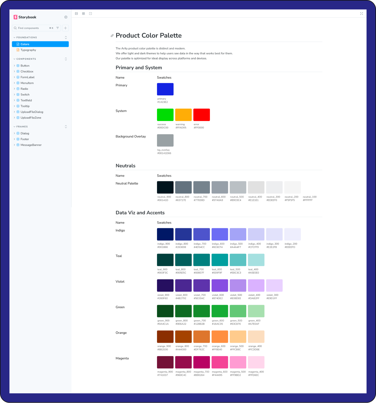
I created the Colors page using MD and JS with some HTML/CSS, making sure colors on the 900 to 100 scale were comparable vertically.
Created by me